I’ve been working on several projects dealing with responsive web design and multiscreen strategies, since these became a thing. From basically designing and coding websites to writing the related chapters in style guides for blue chip companies — I somehow unintentional specialized in this field.
In the work for my clients I often used a map of the most common screen sizes. I found this map very helpful and in time this map evolved and transformed. My approach stood the same: I wanted to create a map that would:
- provide an overview of the most common screen sizes,
- create an understanding of how the different screen sizes play together
- be a working tool for designers and eventually also developers
In this article, I want to take you thought the transformation process of this map.
There are already similar things.
A lot of designers and developers are working on gathering screen information and visualising the many screens sizes out there.
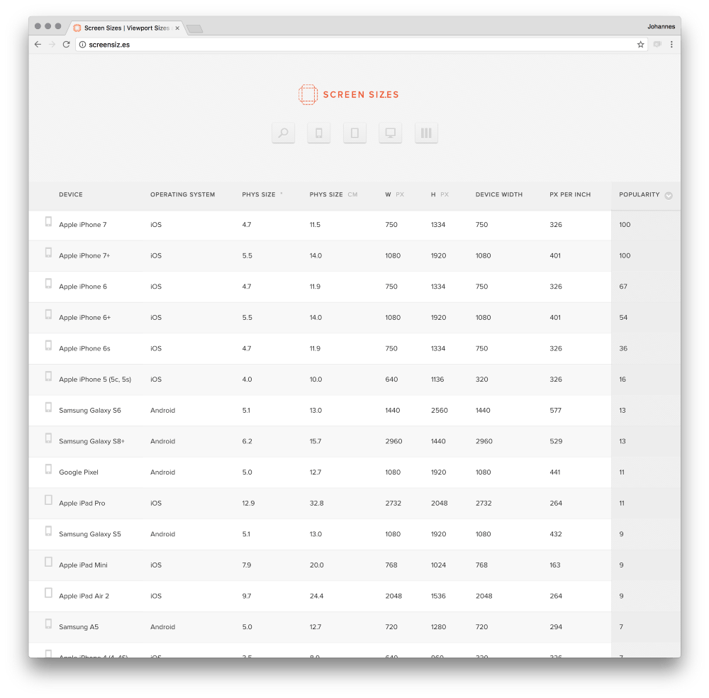
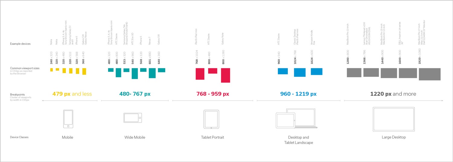
You will find a bunch of websites with table lists where you can find sizes, devices and resolutions.
Very powerful tools — still they do not provide an useful overview nor give an understanding how different screen sizes play together.
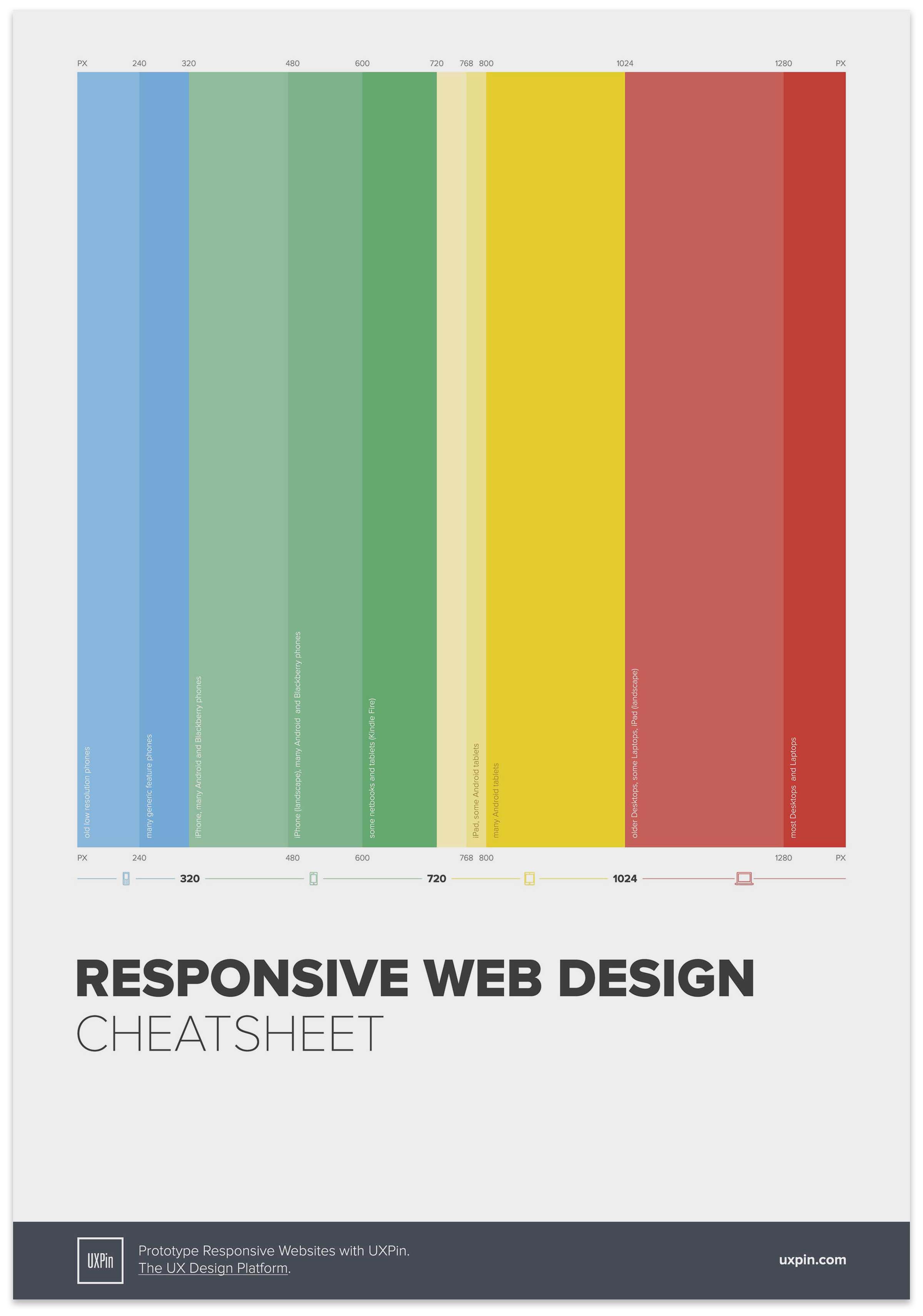
There are very cool visual maps as well: Ben Gremillion came up with the »Responsive Web Design Cheat Sheet« to simplify the workflow of defining breakpoints. It does what it supposed to do and is a pretty amazing tool when you want to code breakpoints in CSS.
Ben had a different target than me. To get an understanding of the screens out there, I am missing some information.
How I started
My very first version of the map — about 5 years old — reflects a common practice of that time where breakpoints in responsive layouts where build in device classes. Working with it, I missed the possibility to compare screens to one another .
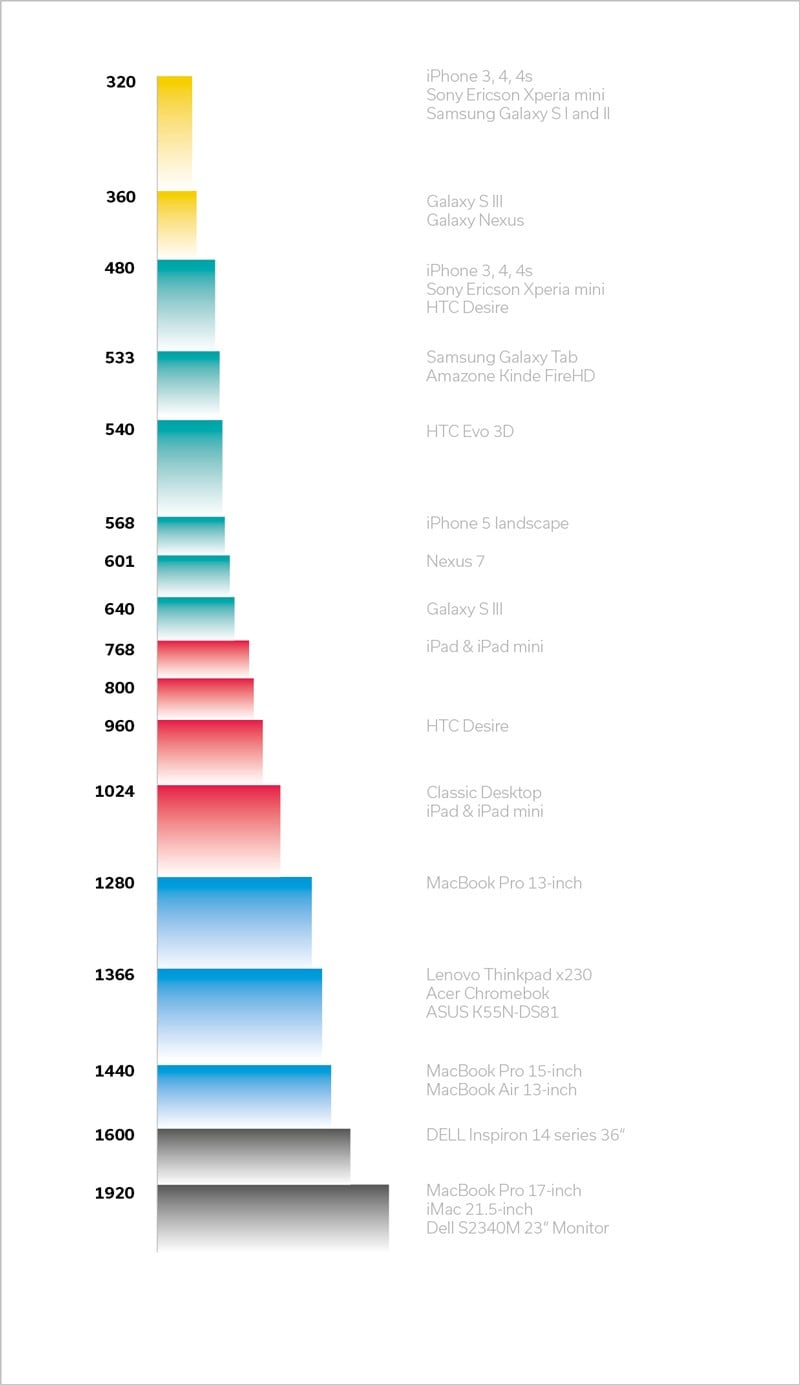
Since scrolling is most commonly vertical, the width of a screen has of more importance in layouts than its height. Following this, I tried to organize the screen sizes vertically so it would be easy to compare it’s widths.
I somehow missed the height still in some projects.
After some time, I wanted to start again with a different mindset. I arranged all screen sizes on top of each other–working with transparencies, tried outlines and shadows to separate them. Values would be a side note and it would be easy to compare screens.
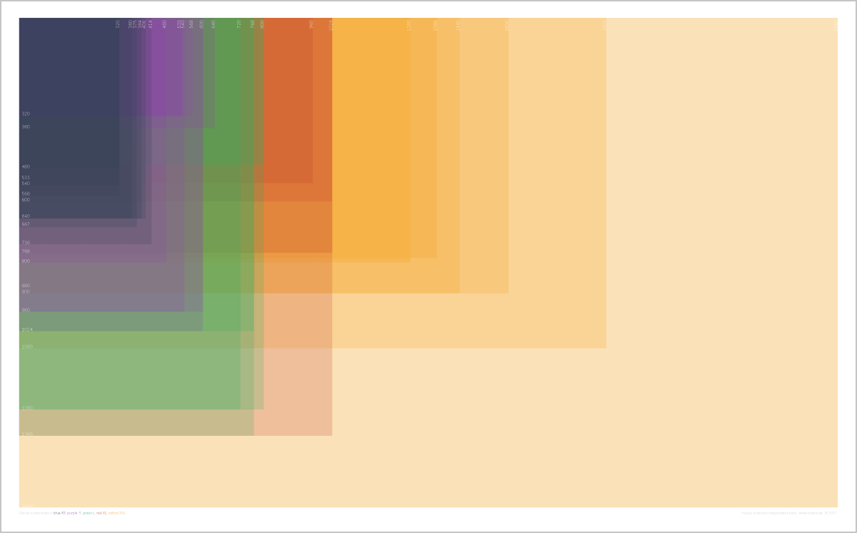
I tried different alignments, to find a perfect reading experience for the screen comparison. I ended up with the last of the following three variations.
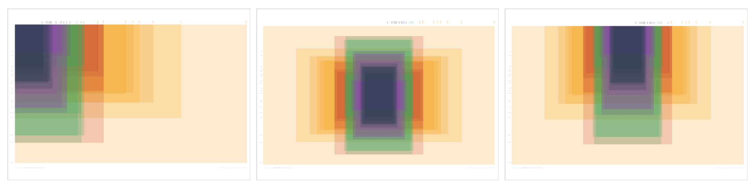
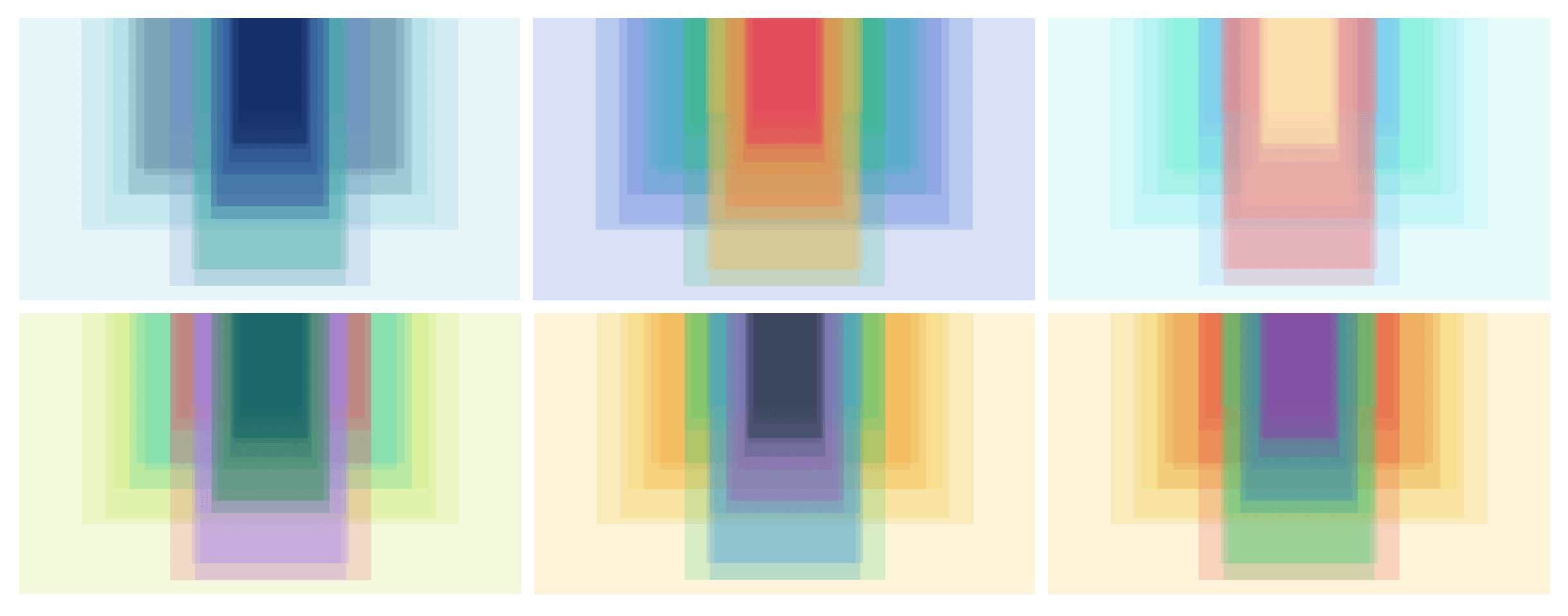
Once I started to explore colors, I was feeling like designing windows for a church. Following, you’ll find some of them. I felt lucky with the last one: the color groups differ proper and the tonality is quite neutral as a whole peace.
Finally, here I was with a vector file of screen sizes arranged in a visual graphic.
This file spoke to me: »Turn me into an interactive SVG«.
And that is what I did.
Here is a link to the live version: www.screensizemap.com
(Funny side note: it works best on desktop – don't ask why 😇)
And if you like it, give it a vote on product hunt!