A case study on giant monitors
When talking about responsive web design, most designers and developers immediately think of websites on smartphones, tablets and laptops. Once in a while, however, a client comes along who displays more than half of their traffic on large desktop screens. In this article I want to share some ideas and UI-patterns I found useful while designing a website “large desktop first” … while of course still making it scalable down to mobile screens.
This article is aimed at product managers, front-end developers and designers of digital products – especially in the business-to-business area.

Some things upfront
(1) Large desktop is not television:
When thinking of large screen sizes, some argue that it could be more like user interfaces on our televisions, such as game consoles or smart TV UIs. Sadly, it’s not the same at all. There are some big differences between large desktop and television which influence the layout to a large degree:
- The context of usage differs a lot. While television is a “lean-back” experience, slumped on the couch munching popcorn, the large desktop is more “lean-forward”. UI-Patterns can be different to the web. Just think of scrolling directions in television layouts.
- The viewing distance to the screen might be two to five meters for a television, while the large desktop user still sits in front of a table and has a similar distance than a laptop user (let’s say 50 - 80 cm). Font sizes, paragraph widths, picture sizes and in result layout formats are different.
- The input method is in most of the cases a 5-Key controller. Some TVs might have a pointing device and even a keyboard. Still, television is a lean back experience.
Thus, we cannot adapt from television layouts.
(2) Understanding the user and his device:
When I viewed my client’s analytics data, it showed that most of the visitors had 1920 pixel wide screens, followed by 1680 pixels. It’s likely they sit in front of a Dell-desktop-thing, an iMac or a similar large monitor. When we design for these screens, we have to understand that most analytics don’t show us the actual viewport size (meaning how large the user scaled his browser window). So the actual size of the website could be a laptop layout while displayed in a scaled window on a super large screen. Still there is the possibility that the user might want to see the website full screen, even on large monitors. As responsible designers, we take care of that layout size as well.
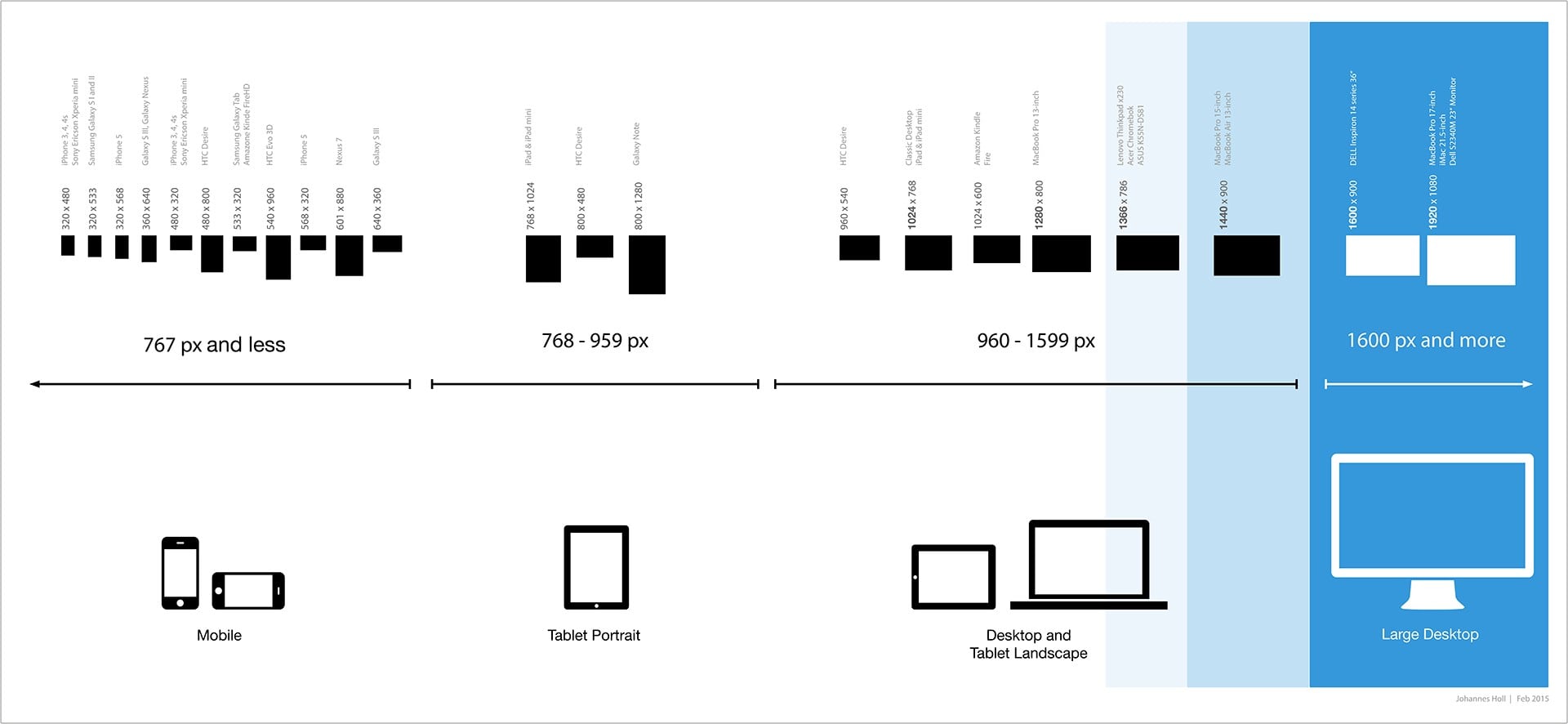
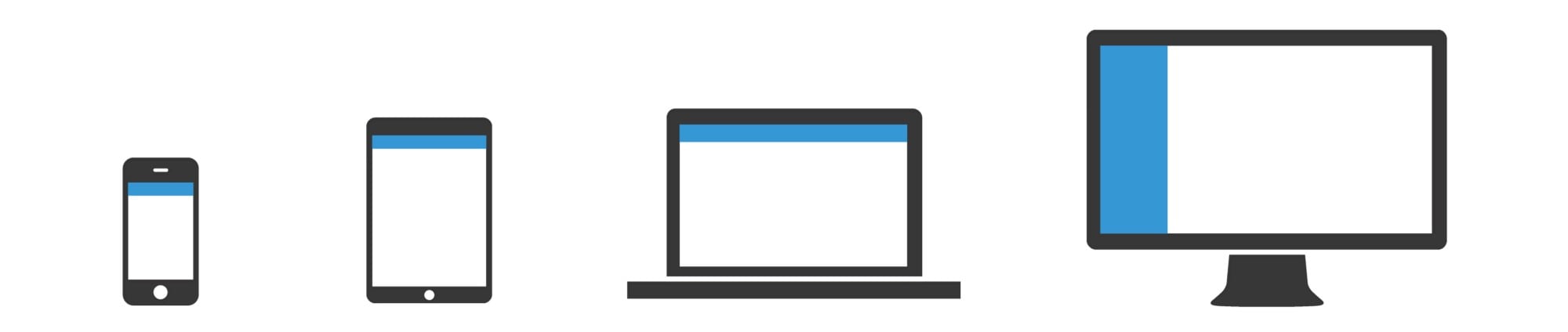
(3) So what are we exactly talking about?
When I talk about large desktops, I mean devices that are bigger than regular laptop size screens, like MacBooks or Windows laptops. Large desktops are iMacs or Dell-Monitors with 20+ inch screens. The following chart demonstrates where we are heading for:
Enabling the large-desktop experience
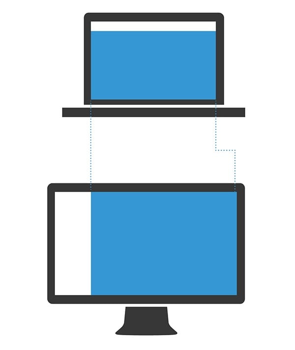
One of the first layout decisions to take is how your website makes use of the given screen estate. There are generally two options how to deal with that in a responsive layout:
A) Fixed layouts will limit the width of the page in every breakpoint and keep the layout to a set width.
B) Liquid layouts stretch over the whole screen width, always using the maximum space of the current size of the viewport.
I find that bit very hard to explain. Here is a little demonstration:
When a website wants to offer a large-desktop experience it is recommended to employ a liquid layout in order to make use of the whole screen rather than including left and right page margins.
Comeback of the left-hand navigation
When I started exploring layouts, it became clear very quickly that there is a lot of scope when it comes to width. Using some of that width for navigation could leave more height for content and the page itself. One responsive pattern seemed most appropriate:
Webpages can only grow in width to a certain length. Paragraphs get harder to read when the line-width becomes too long. Too much content next to each other makes a page look crowded and awkward to scroll, while adding more white space may make the layout look too sparse. However, as the width of the actual page stays almost the same compared to the contiguous breakpoint (laptop layout), only a few adaptations are needed to be made to make the content fit the screen.
The layout blow-up
A large screen offers a lot of space for the layout and that space can be used for more functions, more details or more content at a glance. Besides making use of that extra space in this way, we might want to scale the whole layout slightly. This can enhance the readability and provide the user with a stunning experience that fits the screen size and accommodates the larger viewing distance.
A straightforward implementation is using an elastic approach where all margins, paddings, font-sizes and other values are in relation to the default font-size (using the units EM or REM). This structure enables us to blow up the whole layout by changing one parameter: the font-size in the body-tag.
In my project I changed the font size from 16 to 19 pixels (118.75% of default font size). I applied this layout blow-up when the viewport got bigger than 1600 pixels (100 EM). Thus, the large desktop experience offers a slightly scaled layout with better readability.