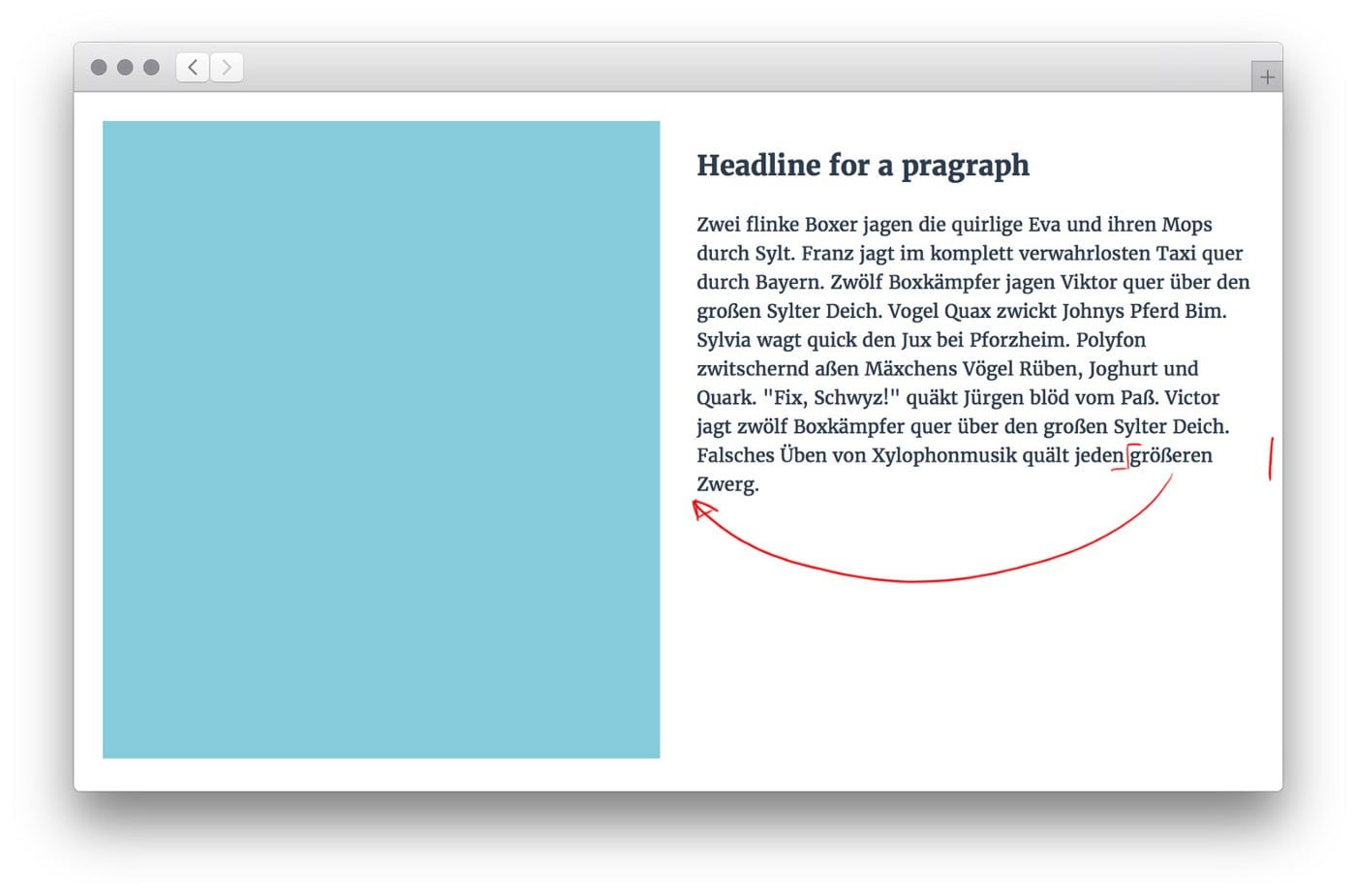
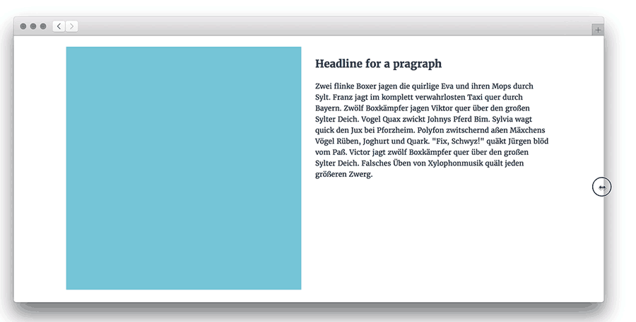
Improve line-breaks and hyphenation on your web pages with computerized typesetting. It’s fairly easy.

Booking a good visual designer is one thing you can do, if you want to have someone taking care of font, font-sizes, line-heights and so forth. Still most designer will deliver static layouts. The moment those »graphic designs« turn into actual code, responsiveness brings much more complexity to the visual concepts and the contents as well. Later on — when someone else is maintaining those pages and changes texts and headlines — how can one ensure text behaves nicely on different screen sizes.
Often, content mangers and UI writers are the ones stumbling upon visual bugs — struggling with text appearance on different devices and hacking it into the admin panel of backends. If you are one of those or interested anyway, this article might be helpful.
What is actually the problem?
Misplaced words and badly separated text lines can have a negative impact on readability and the aesthetic perception of a text piece. Since ages, typesetters have had dedicated terms for those phenomenons print media. The therms orphan and widow describe text lines that are separated at the end or the beginning of a page.
Creators for digital media don’t have such terms yet. We could still hope that someone might solve them with an algorithm in the future. Until then I would love to suggest a term and a solution. I’ve identified five typesetting problems. Let’s name them in the same terminology that typesetters started with back in the days of print (even going into danger of being political incorrect 😇)…
➸ The Stepfather
A very long word that divides a paragraph or even breaks a layout.
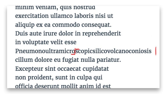 Stepfather: a word so long it messes up the layout. This thing happens often with URLs.
Hidden Stepfather
A very long word that divides a paragraph or breaks a layout in just some layout sizes, e.g. Smartphone.
 Animation showing a »hidden stepfather« popping up on smaller screens.
Solution
The markup tags »soft hyphen« (in code: ­ or ­) enables you to define a possible hyphenation inside a word. Each browser will then independently decide when to break the word and add a hyphen.
This sentence has a super­long­word.You want to try it yourself? Visit my live demo on codepen.
➸ The Waif
A single word left at the last line of a paragraph.
 Typographical waif: you want to move one word down, so it forms a proper last line.
Hidden Waif
A single word at the last line of a paragraph that appears in just some layout sizes, e.g. iPad.
 Animation showing a typical »hidden waif«.
Solution
Adding »non-breaking spaces« in the markup with   or   will make two single words stick together no matter what. Make sure that you don’t apply »non-breaking spaces« in between long words — it might end up in a »stepfather«.
This two words should not separate.Use »non-breaking hyphens« ‑ for words that are regularly written with a hyphen, e.g. »long-term«. You want to try it yourself? Visit my live demo on codepen.
Overview of special characters for typesetting
Beyond those techniques, there are a number of tags you can use to optimize text appearance. Such as forced hyphens and zero-width spaces. In responsive design, you have to use those ones very carefully and check how it performs on different screen sizes.
Soft hyphen
­ add hyphens automatically when the word needs to break.
Non-breaking space
add a space that will never break two words
Non-breaking hyphen
‑ add a hyphen that keeps words together in any case
Hyphen
‐ is a regular hyphen
Zero-width space
​ add possible break-moment in words without adding hyphen