Six privacy apps in four months
4 months 6 apps
shipping biweekly new features to development
Design System and UX Patterns
aligning three mobile apps and overall account functionalities
40+ user interviews
to test usability with prototypes and ensure desirability by users.

Design Lead
UX / UI Designers
Illustrator
About the project
Proton is a Swiss client that specializes in secure communication. The company offers privacy-focused alternatives to established online services like Gmail or Outlook. However, despite being highly valued by users, their solution lagged behind its main non-privacy-focused rivals in terms of usability. Our task was to reimagine user-friendly mobile apps based on strong security values. We redesigned their core mobile product, ProtonMail, and created new products such as Calendar and Drive in collaboration with their product teams. We shipped biweekly to development for Android and iOS devices, including smartphones and tablets of varying sizes.
Breaking down design complexity
for a whole product family
To ensure consistency, we developed a comprehensive UI guide and design system. This includes standards and guidelines for typography, color, and layouts. Additionally, we incorporated a look&feel that would differ from its competitors and communicates the Proton product brand.

We designed with mobile users in mind. In addition, we optimized these apps for tablet, ensuring that users can enjoy the same seamless experience on larger screens. We provide users with a consistent experience across all platforms, regardless of the device they use.

The apps were developed separately for iOS and Android. The Android version was prioritized due to the majority of Proton customers using Android devices. Both versions underwent rigorous testing and optimization to ensure they felt native to their respective platforms while providing the same high-quality experience to all users.

One of the most popular user requests was the addition of a dark mode feature. When designing the dark mode option, we paid close attention to the color schemes and contrast levels to ensure a visually pleasing and user-friendly experience.


Mail, Calendar & Drive —
An integrated family

Between utility tool
and direct messaging
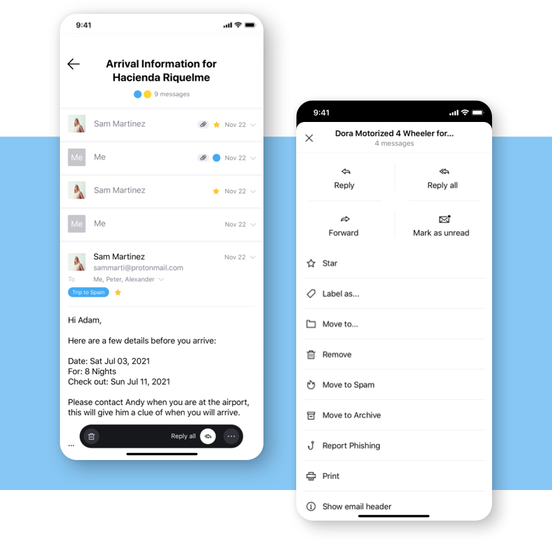
Our design strategy for the ProtonMail redesign involved finding a balance between a utility tool for productivity and a conversational tool for direct messaging. We accomplished this by optimizing the product with organizational features, such as labels and folders, while also creating a chat-like experience in the thread view with visualized recipients.

Honing in on
organisational features
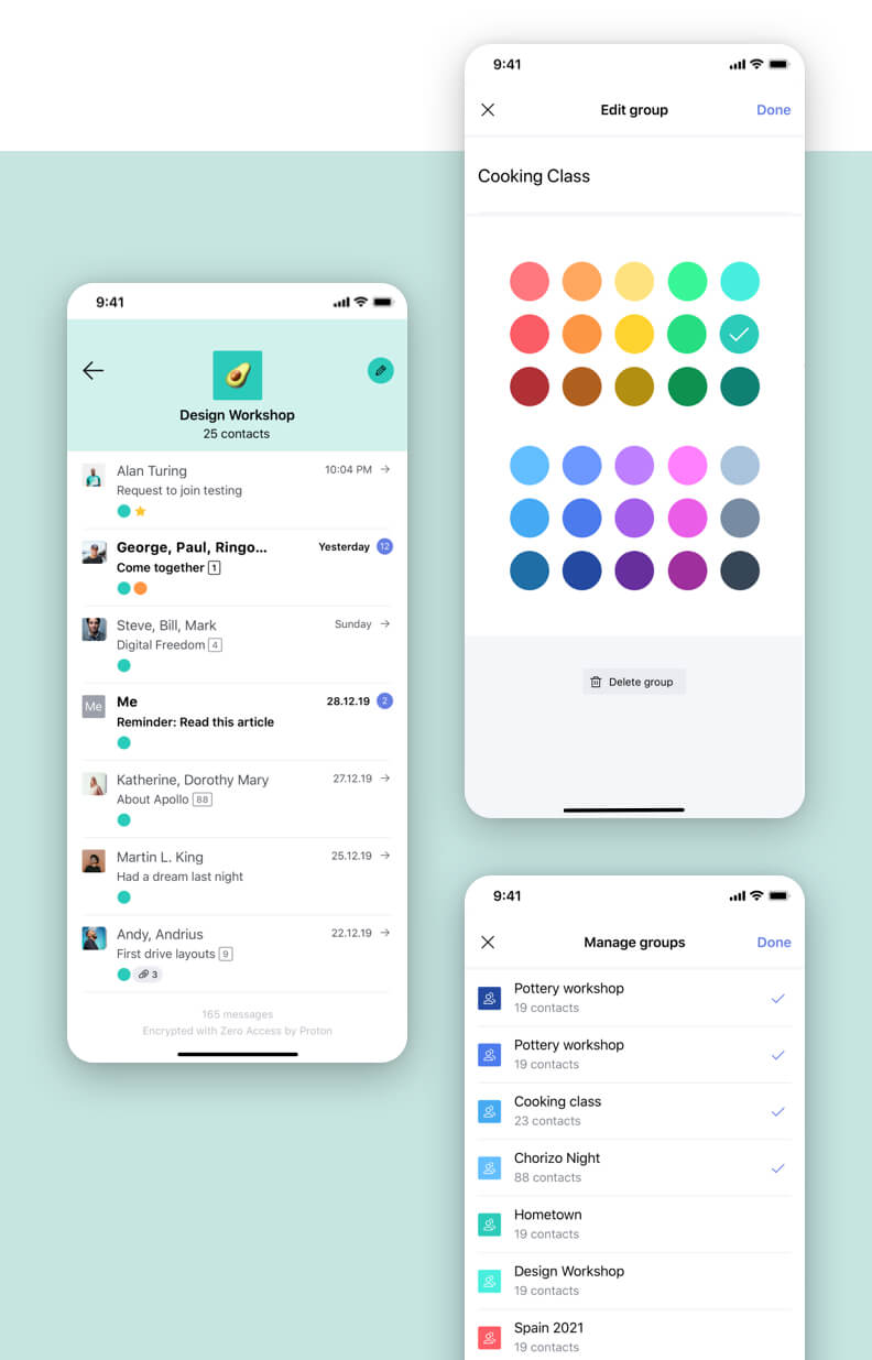
Rather than conducting a complete overhaul, we carefully reviewed the previous design and technical decisions. We only proposed changes when they served clearly defined user goals. Among other things, we restructured the menu and email actions, revisited the icons, decoupled labels and folders, and made the senders more prominent.
Organise tasks
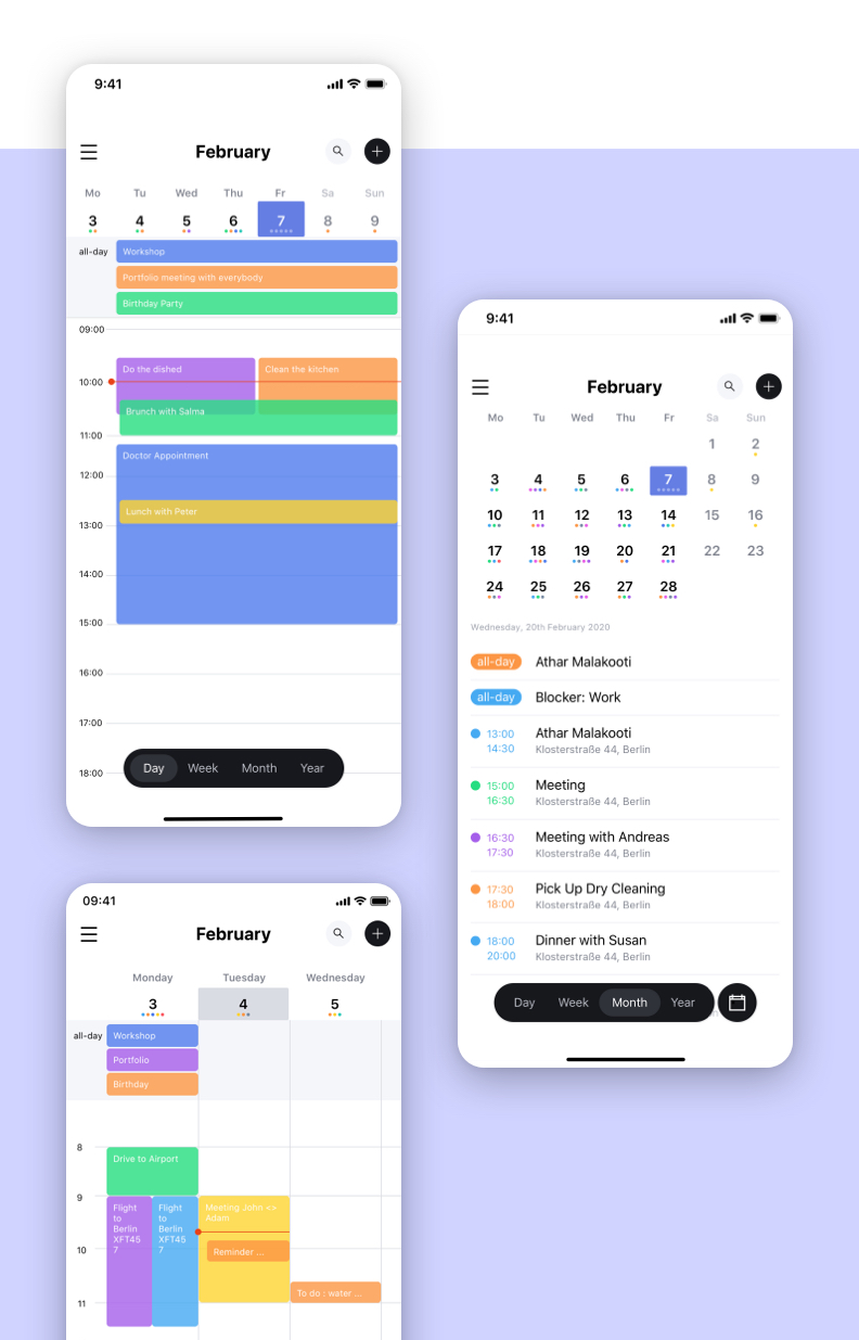
via various calendar views
The number of artboards required for shipping kept increasing as we tried to account for all the edge cases and potential errors. These included multiple overlapping events, conflicting calendars, recurring and multi-day events, customized reminders, and notifications.


Sync across devices
Easy sharing & offline access
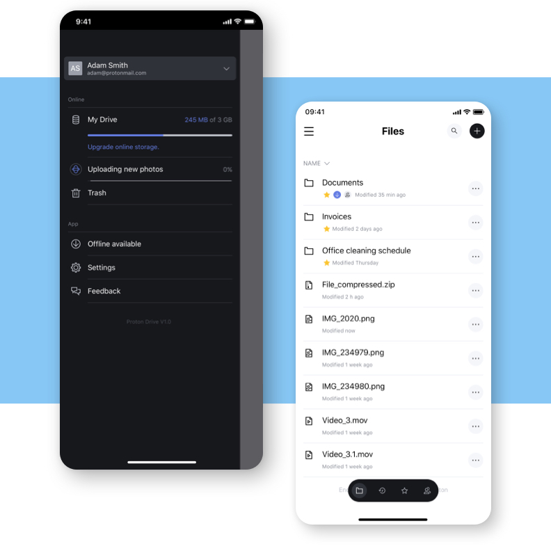
It works just like other file storage services, except everything is encrypted by default. File content, file names, folder names, and paths remain private. The user can easily share files with anyone with one click and manage permissions and collaborator privileges. The storage is designed to be fully accessible offline. We also offered a clear overview of space available — both online and on a local device.
your project.
