Mobile First – Why we don’t call it “Mobile Only” and how good UX design helps you to reach your customers in the best possible way ...
The requirement, or rather the request to consider, think and design “Mobile First” has been around for a long time. What does it mean in detail and how does Mobile First influence the way we’re working on digital products?
Current studies confirm an ongoing trend: Worldwide, the internet is mainly used via mobile devices:
 Market shares of the different display sizes.
For managers of digital products, managing directors who want to digitize their company, product owners and everyone who is interested in the complex requirements for the UX design of digital products and websites for mobile devices.
In this article we answer the following questions:
- What does Mobile First mean?
- Mobile First explained on a best practice
- How does Mobile First and User Experience Design fit together?
- Responsive Design or Adaptive Design?
- What does Google mean with Mobile First in terms of SEO?
- And how is Google’s “Mobile First Index” defined?
- Will Mobile First leave the desktop superfluous?
What does Mobile First mean?
Companies would do well to develop their products under the premise of mobile first, as this approach harbors complex strategic advantages. The most obvious: the products reach market maturity much faster and are therefore very quickly available to a large number of users. The leaner development process, on the other hand, keeps costs lower and thus clearly minimizes risk. The reduction to mobile applications and the focus on essential and structured information lead to an improvement in product quality. Since less information is provided, less data has to be transferred, which leads to significantly shorter loading times. In addition, there is the option of using smartphone-specific functions – such as touch input, localization or camera – to design completely new fields of application.
Good to know: The mobile-first topic only relates to web solutions; native apps, for example, remain unaffected.
 Device compatibility is accompanied by strategic product growth. Step by step, the application – and thus also the UX design – is being optimized for more and more devices.
Mobile First explained on a best practice

This schematic illustration displays how the width of the layout varies on the different devices – starting on the mobile screen.
From mobile to tablet to desktop, it increases flexibly according to the requirements of the respective device. Once the maximum width is reached, the layout gets kind of stuck. In the large desktop view, only the margins expand – as the layout has already reached its maximum dimension.
From a technical point of view, the maximum width is referred to as a “wrapper” – a box that frames the content.
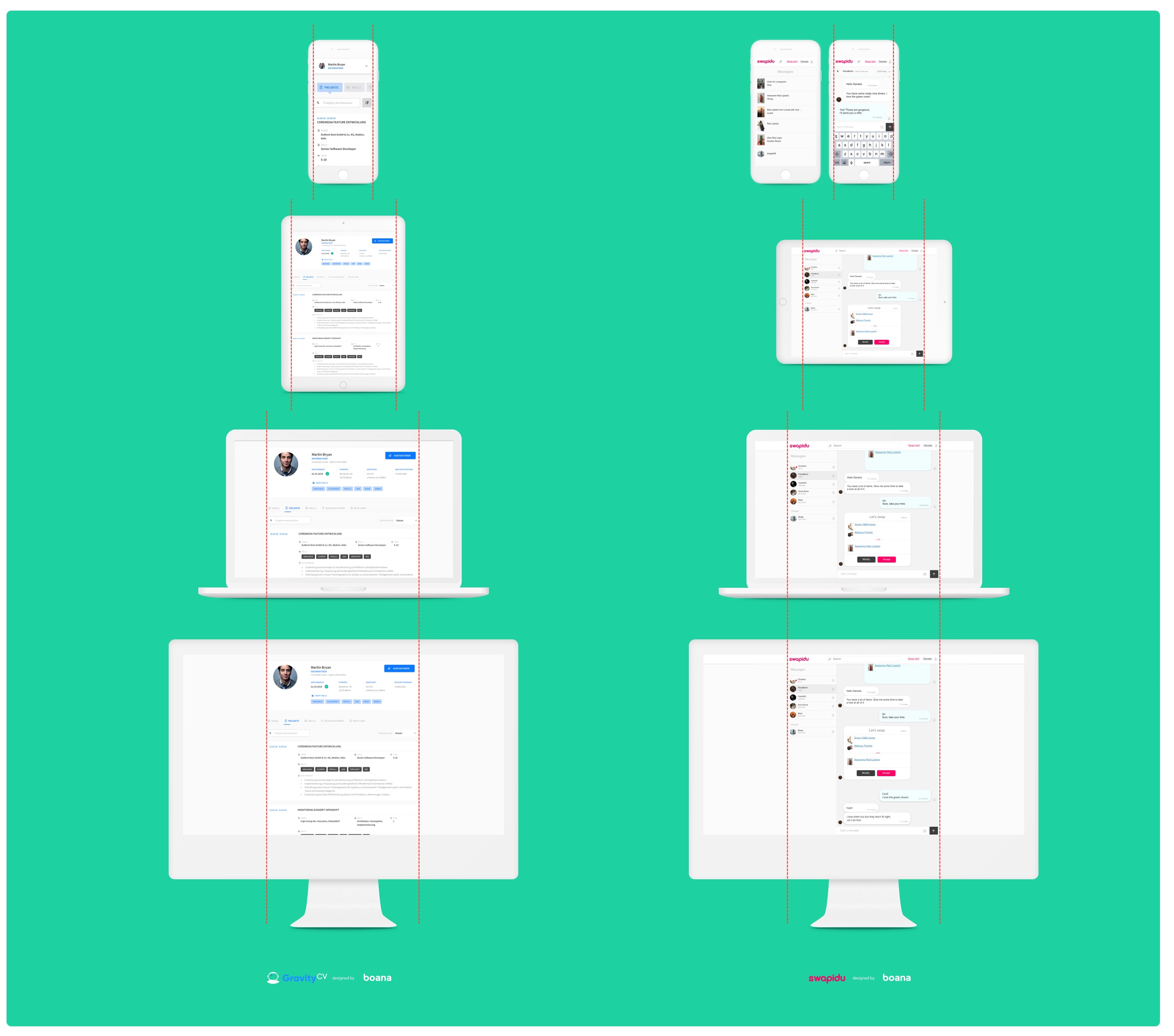 Gravity CV is an service for creating and managing CV's. Swapidu is an exchange platform for makeup articles, whose operation under this brand has been discontinued.
How does Mobile First and User Experience Design fit together?
The UX design for mobile screens deals with a whole bunch of challenges, because a smaller screen per se offers little space for the layout. There is also a different input mode – while the mouse pointer on the desktop can also be navigated to small buttons, the buttons on the smartphone must be significantly larger. A circumference of 48 pixels has been established as the perfect size to ideally localize a touch input. And this is not about the user's individual finger size, but about the optimal technical surface of a multi-touch screen. The spacing – i.e. the distances between different buttons – also belongs to this topic.
For a good representation and optimal accessibility of the content, the usage situation should always be considered: When using the device outdoors, be it in strong sunlight or at night, optimal contrasts must always prevail, e.g. to ensure the good legibility of fonts at all times. Shorter stays and interrupted sessions due to frequent distractions are also the rule when using it outdoors or “on the move”. In general, it makes sense to always be aware of the diverse usage environments. This also includes the simplest possible navigation and restriction to only a few and selected features.
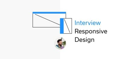
 Mobile Use Case in a subway in Tokyo. Picture: Hugh Han, Unsplash.
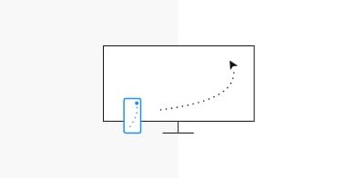
Furthermore this has an impact on the provision and hierarchy of content. Texts should be formulated to the point in order to find enough space even on small display sizes. Efforts are also being made to replace instruction texts with icons when it comes to highly conventional actions that have already become firmly established on the market: e.g. a paper plane for sending an e-mail or a trash can for the “delete” command. The usage situation that deviates from desktop is always reflected in the use of device-inherent functionalities. What does that mean in concrete terms? A restaurant website, for example, is very likely to be used differently on mobile than on desktop. Anyone who wants to find out about a restaurant on the go should be given the opportunity to get the fastest way to get there via an integrated GPS and an optimized call-to-action. Therefore it is crucial that the operating concepts work coherently on the different end devices. This allows users to perceive such a restaurant website identically, i.e. simply and intuitively, both on their desktop computer and on their smartphone.
Another central issue: Typing text on a mobile screen often causes difficulties for users. It is therefore advisable to build forms as clearly as possible and, for example, automatically provide the appropriate keyboard – either numbers or letters – for each input field. In general, it is important to pay particular attention to the haptics, i.e. swiping, scrolling or zooming when using mobile devices.
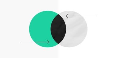
Responsive Design or Adaptive Design?
When it comes to designing content for mobile devices, everything speaks for a responsive design that works equally well on any screen size.
More than ten years ago, the American web designer Ethan Marcotte came up with the term responsive web design. His insight: Constant change is one of the greatest strengths of the Internet and the development of new devices. Every year new hardware with new screen sizes conquer the market. Instead of producing a product in an adaptive web design, i.e. individually for each device, responsive design is not about fixed pixel sizes, but about fluid layouts.
Every responsive product starts with a grid that breaks at defined breakpoints and thus automatically adapts to the respective device of the user. The additional use of a so-called “liquid design” is advisable if the available space on all devices has to be optimally utilized.
 The Boana Screen Size Map: available digitally and as a poster for free download on screensizemap.com.
What does Google mean with Mobile First in terms of SEO?
The following statement can be found on Google’s developer's page.
Mobile is changing the world. Today, everyone has smartphones with them, constantly communicating and looking for information. In many countries, the number of smartphones has surpassed the number of personal computers; having a mobile-friendly website has become a critical part of having an online presence.
So it's about optimizing content and functions that are used on mobile devices. The higher the quality and the more accessible the content, the better the ranking in Google’s search results.
What does that mean in concrete terms for the creation of such content? Simple answer: the mobile version is developed first. With every project, it is therefore advisable to design for the small screens first, because small screens = greater complexity. You start practically in the “tightest space”. Later upscaling to desktop formats usually does not cause any problems. Other positive effects: this kind of implementation is the quickest, requires the fewest resources and delivers the fastest outcome.
And how is Google’s “Mobile First Index” defined?
For about five years now, Google has been advising website owners to offer their content optimized for mobile use and has since then repeatedly announced the “Mobile-First-Index”. It should definitely be ready in March 2021. If there are still different adaptive designs for a website, the mobile version is the primary source for the Google bot.
Anyone who has already built a responsive version of their website can by no means sit back and relax. Designs and functionalities – as described above – severely impair the mobile use of a website and are also detrimental to the ranking in Google’s search results. This also includes such decisive factors as fast loading times. Today, users are no longer willing to wait for a slowly loading page – the bounce is almost guaranteed, and a renewed visit to this website is unlikely due to the initially poor user experience.
Will Mobile First leave the desktop superfluous?
A clear no, because it is called Mobile First, but not Mobile Only! We find very explicit cases in the operational environment of SMEs. These are often located in the area of “serious work” with large amounts of data, such as in accounting or project planning. In such contexts, working on large screens will continue to be essential in the future. Nevertheless, it should be possible to make individual aspects of this work also available on the go, be it status queries, lists or the like. Here the entrepreneur together with the UX designers should decide what they want to put the focus on. A look at the website's analytics data provides the basis. If the majority of cases with primary desktop use are present, that would be a more than obvious signal.